Banner Studios Strategic Rebrand
SMPTE color bars
A way to signal that the signal is lost
The grid system
We used this universal sign that the signal is lost to organize all our design choices.
Why?
Because what Banner Studios does reconnects the lost signal.
built on the grid
our primary logo form
She’s stacked
Our primary logo is stacked. Like, with muscles and bountiful bodacity.
Hidden magic tricks
If you look closely and let your eyes lose focus just a little bit, you’ll catch hidden gems. Like watching a Hitchcock moving and noticing his silhouette saunter across the screen. But pants. And a magic wand.
The Banner color palette is also built on the SMPTE color bars grid. We named each color something special, like a baby. But feral. And magic. And with favorite film references, too. Like Rollergirl.
All designs created in partnership with Jessica Conquest, Design Director at Banner Studios.
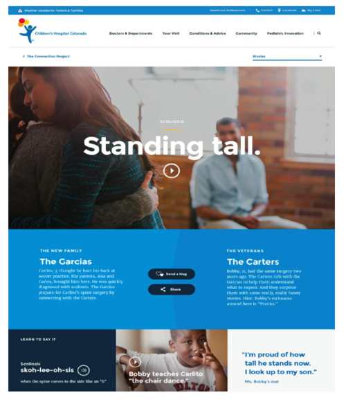
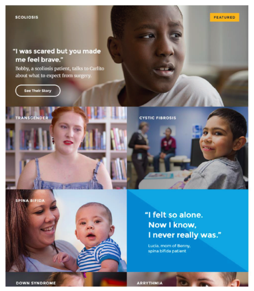
Children’s Hospital Colorado
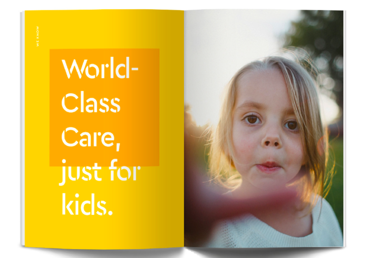
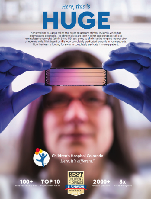
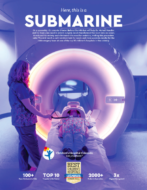
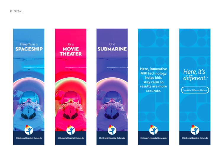
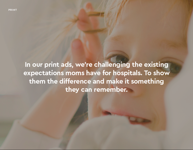
Most parents think all hospitals are the same. Children's Hospital Colorado wanted to help parents understand that this hospital is different — because it’s designed for children. From littler stethoscopes to CAT scan tunnels that transform into under-the-sea adventures, the specialists at this hospital truly provide the best care for children. And we wanted every child to have a chance at accessing that.
From pitch to production, in partnership with teams at SapientRazorfish.
